Trends & Benchmarks
The Trends & Benchmark dashboard measures your attack surface size, risk counts, and the average length of exposure for risks. These metrics and their supporting segments are trended over time to track changes. This helps you measure progress toward improving attack surface hygiene, reducing risky exposures, and remediating critical risks.
Metrics
The Trends & Benchmarks Dashboard focuses on three core metrics:
- Attack surface size
- Active risks
- Average length of exposure (in days)
The dashboard provides a top-level metric and calculates counts for different breakdown segments of your attack surface.
Learn more about metrics and how to use them.
Breakdown segments
Click a top-level metric to filter the dashboard to show relevant breakdown segments. These segments provide more context on whether a top-level metric has changed.
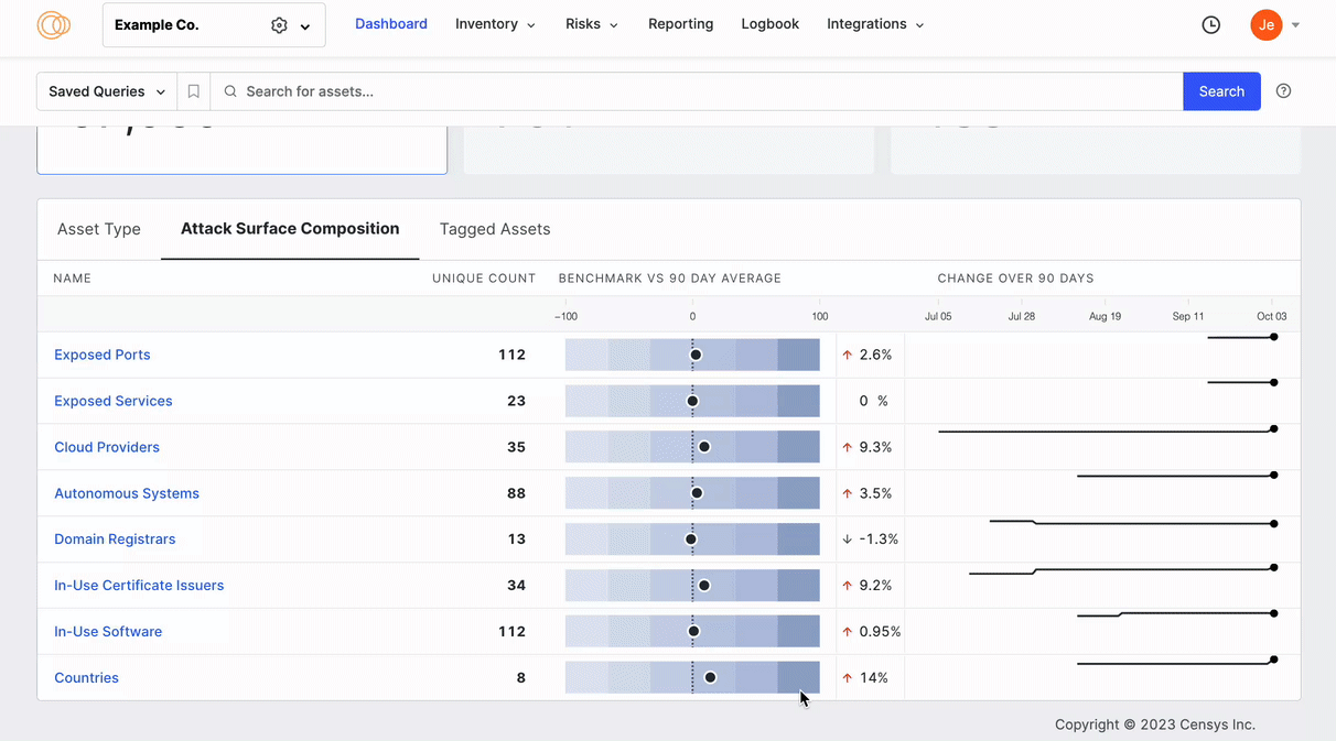
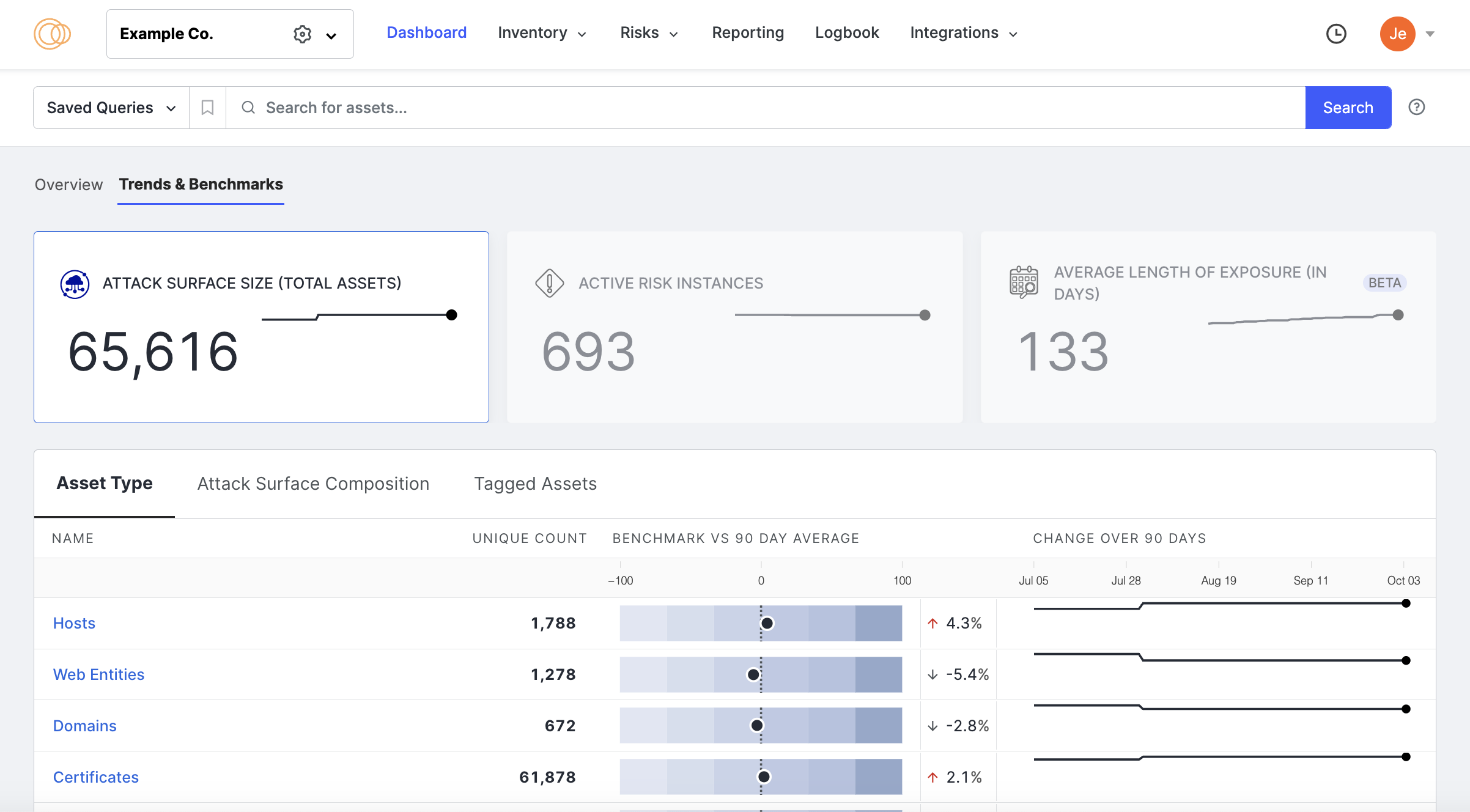
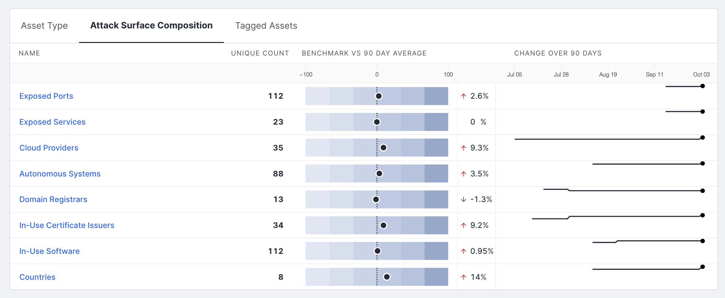
Attack surface size
For attack surface size, segments are listed by asset type, attack surface composition, and tagged assets. Explore trends in assets and their related data, such as domain registrars or certificate issuers.
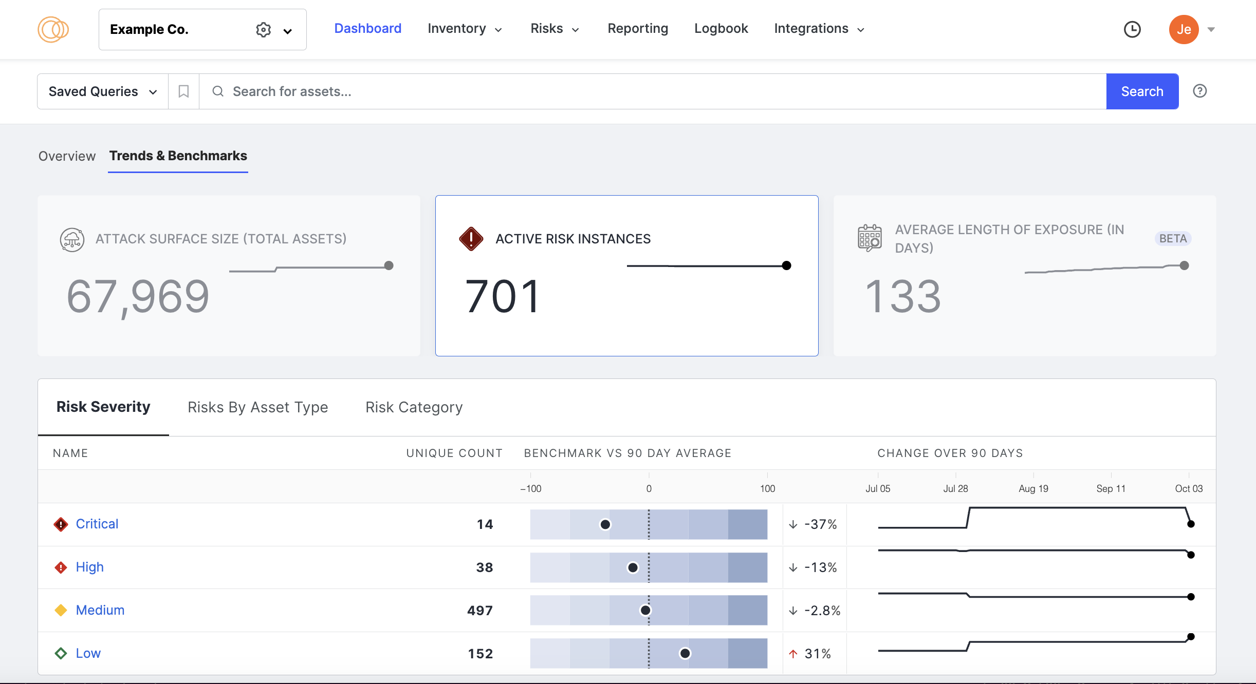
Active risk count
For the active risk count, segments are listed by severity, risk category, and asset type. Explore changes in severity, category, and asset type risk counts to explain why the overall risk count is trending up or down.
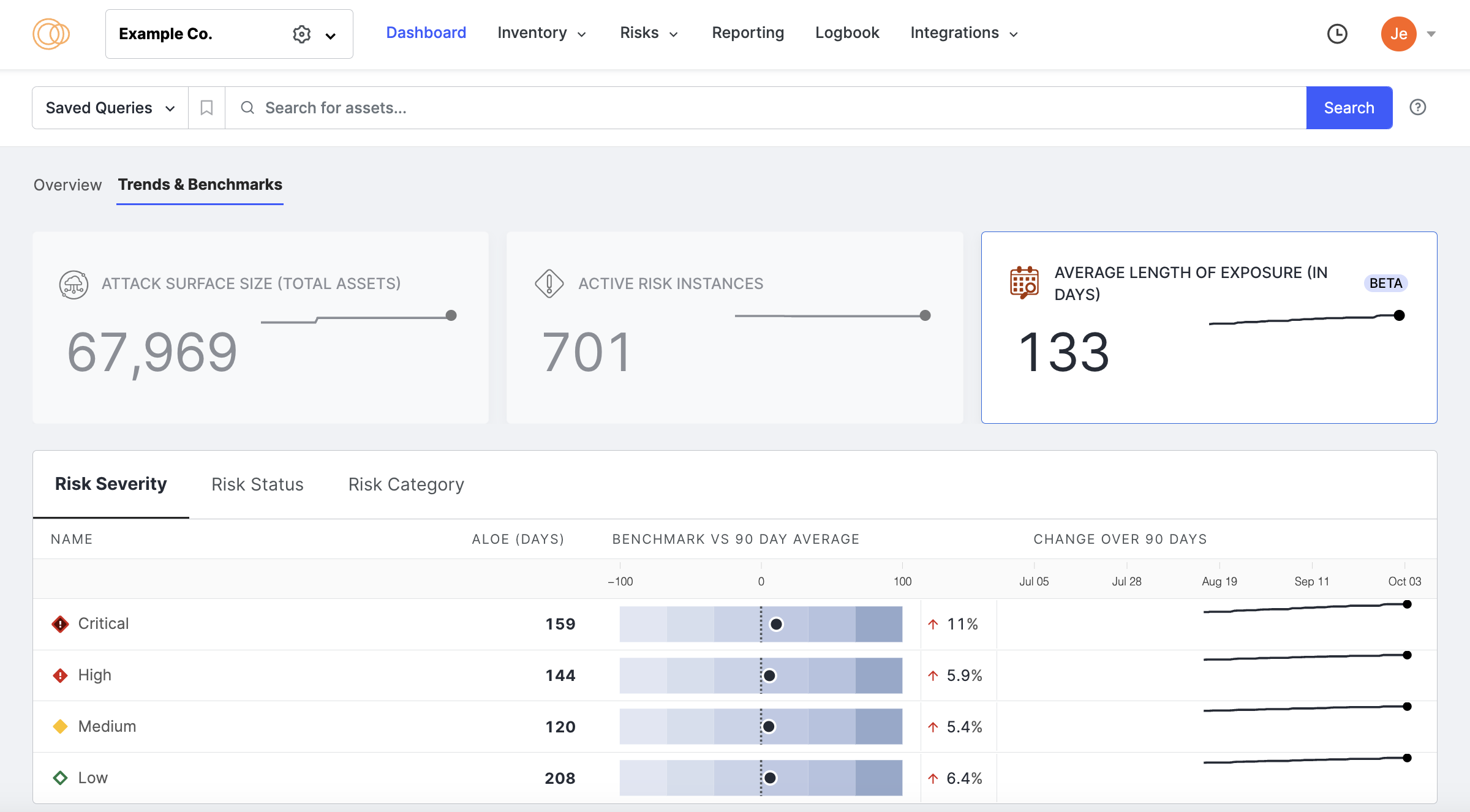
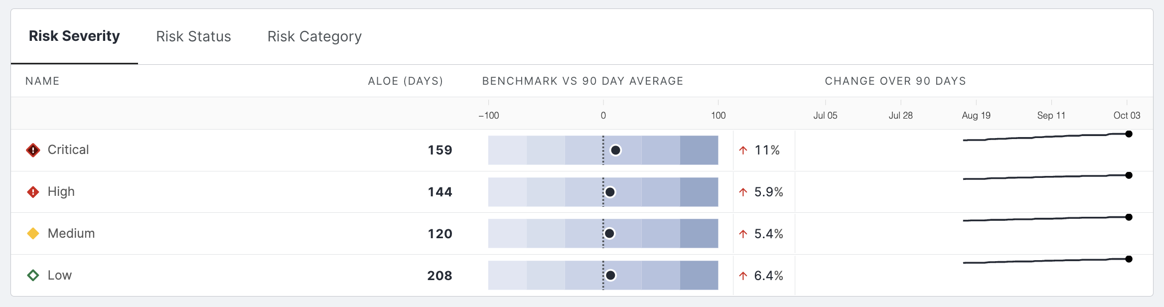
Average length of exposure
For average length of exposure, segments are listed by severity, status, and risk category.
Explore changes in exposure length for different severities, categories, and asset types to explain why the overall length of exposure is trending up or down.
Benchmarks
The benchmark sprite line shows a percent change compared to the 90-day average for a breakdown segment.
For example, the table below reports that the current number of unique host port numbers (112) is 2.6% greater than the average number of ports open over the last 90 days, while the number of unique host countries is 14% greater than the average number of host countries reported over the last 90 days.
90-day trend line
The 90-day trend line charts count for a metric or breakdown field over a 90-day period.
For example, the table shows counts of the average length of exposure for critical risks each day for the past 90 days. Historical data collection starts on the date the attack surface is created. For customers that have fewer than 90 days of history, the graph shows counts for the days that data is available. Time-series and 90-day benchmark data are calculated at 12 am UTC for the past day.
Clickthroughs
Click any breakdown segment on the attack surface size and active risk count tabs to see the raw data contributing to the metric's current value. Clicking on a breakdown segment may also show a filtered view of the asset inventory, risk instances, or inventory aggregations. You can export the CSVs of these filtered views as a report to share with stakeholders and others on your team.